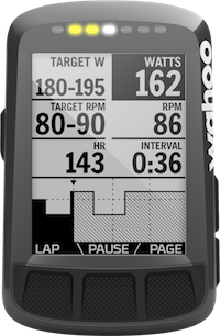
Wahoo Bike Computers
It’s fascinating how sometimes rather small companies disrupt a (niche-)market that is controlled by one or two big players. That is what happened in the bike computer/navigation market. It was almost exclusively controlled by Garmin just a few years back. When I started cycling I bought a bike computer from Garmin. I knew Garmin’s GPS devices from cars and they offered a devices made for cyclists who ride longer, non-competitive rides - the ‘Touring Edge’.
The device technically works. It does what the box says: it displays a map on the display together with the current position. It can show a precalculated route, save the traveled track and sync it back to computer. It has the route’s elevation and some statistics and live info like (average) speed and direction. In principle it does what I wanted and yet I was pretty disappointed when I used it on my first longer tour. Using the device felt sluggish and complex. And it it seemed more like a dumbed down car GPS than a bycicle computer. But again, it technically worked and so I kept using it.
Until recently: more and more cyclists I saw on the road were using the Wahoo Elemnt. When the Wahoo Elemnt first came out it received mixed reviews and the few people I knew who had used them confirmed that. However, the overall perception (and usage) changed over the last year or so. That got me curious to check the Elemnt out. Were they just cheap? Cyclists are often ready to spend large amounts on frames and parts - why would they try to save a dime on GPS? Or do they have some amazing feature that no other device offered? Is it some kind of Apple-like reality distortion-field, a cult even?

No. Wahoo did exactly what Garmin and the other brands should have done a long time ago: they listened to what cyclists wanted, combined it with current technology and threw away everything else. Some examples:
- A high-contrast b/w-display instead of an okayish color display.
- Actual, tactile buttons. Real buttons with feedback that work at -5°C with winter gloves on. Garmin uses a resistive touch display (ugh).
- A very simple and intuitive UI. Works perfectly while riding. Easy to read and understand.
- Connectivity with pretty much any sensor out there.
- Bright dedicated LEDs that can indicate turn signals (additional to the ones on the screen), new messages or heart rate zones.
- Regular updates that actually make the experience better.
- Easy import of tracks via online services, even without a phone connected.
- Some “live” features and integration of Strava segments.
The last two points are not exactly fair when comparing the Edge Touring to the Elemnt because the Garmin model is a lot older. However, all other changes are obvious to cyclists, especially when they’re a bit tech-savvy — let alone a tester for a manufacturer.
The Henry Ford quote comes to mind:
If I had asked people what they wanted, they would have said faster horses
That seems to be what happened in this case. Garmin built GPS devices for cars and maybe hikers. They added new maps, made the screen a bit smaller and added a new mount. The result is technically a GPS for cyclists — a faster horse.
The first Wahoo Elemnt was a bit bulky and lacked a few features. Wahoo did the right thing: they sold the same hardware with a smaller display (Elemnt Bolt) and released updates; lots of them. Luckily it seems that someone at Wahoo watches out for bloat. It is striking how the Elemnt has exactly the right amount of customizability. The Touring Edge wouldn’t even allow to change the track’s color that was barely distinguishable from some roads.
I’m not sure why I wrote this, but I thought about this damn device more than I would like to admit. More so: I would have given Garmin the same advice 4 years ago when the Elemnt wasn’t even released. It is just so obvious.